Ecommerce is growing at a rapid rate, but do you know just how much business happens over the web? And how much of that business is specifically made through mobile devices?
It’s enough business that you should definitely be making sure your website is easy to use on every type of device, or be okay with losing out on extra revenue if you don’t.
The proof?
Not only is ecommerce on the rise overall, but mobile purchases specifically are predicted to dominate online sales by 2021, driving 54% of all web sales.
Even setting sales aside, the number of users is also worth noting: 80% of Americans are online shoppers — and half of them use a mobile device to do their shopping.
If your site isn’t mobile-friendly, visitors are also 5 times more likely to leave. Even further, over 50% of websites are already incorporating responsive web design technologies that work for all types of devices.
That’s a big chunk of the online market to be missing out on simply because your website isn’t user friendly, especially when one of your goals is likely to provide the same level of service — if not better — than your competitors.
The good news: it’s an easier fix than you might think!
The Limelight Theme offers quick and easy options for tailoring your website to mobile phones, tablets, and desktops.
Read on to learn more about the different types of mobile websites and how the Limelight Theme can help you get your website where you want it to be.
Websites on Mobile Devices: Friendly, Responsive, or Optimized?
There are a few terms people throw around in regards to websites and mobile devices: mobile friendly, mobile responsive, and mobile optimized. While they sometimes get confused, each term means something completely different.
First off, “mobile friendly” is often used as a blanket term for a website that works for mobile users on their devices. While this is technically true, there’s a little more to it than that.
Generally speaking, the consensus is this:
Having a mobile friendly website means someone can view your website on their mobile device. The problem is that it will look the exact same on a mobile device as it does on a regular computer, which means it will be shrunken down to fit the size of the screen. Basically, your website will be supported on mobile devices but won’t change any formatting or design to make it easier for the visitor to use.
That’s a very tiny screen showing some very tiny words that a site visitor won’t be able to read without some frustrated zooming and scrolling. Guaranteed, visitors will have a hard time interacting with it.
A website that is just mobile friendly will end up being too much work and effort for the visitor, which means they are likely to leave in favor of other websites with actual mobile versions (AKA your competition). Being mobile friendly is definitely the first step, but you won’t want to call it good there.
A mobile responsive website will automatically reformat your website to fit mobile screen sizes. This means that your website will detect what kind of platform the viewer is on and subsequently show them the correct sized version of your website. Since the changes are automatic, you’ll typically have to check and fix any inconsistencies or problems that the auto-formatting missed or didn’t fix the way you wanted it to.
Mobile optimization is the best way to engage users across all devices, and it’s definitely what you want if you’re looking to make more online sales. Optimization will allow you to set the specific design and formatting for your website on each type of device. You’ll be able to change specific settings like font size, picture size and order, padding and margins, and even take away multi-column ordering in favor of a bigger, easier-to-read single column format.
Not to mention, making your site mobile optimized will also mean that it’s mobile responsive.
You’ll be able to create a unique, tailored, and user-friendly version of your website specifically for mobile users without messing up how your website looks in its full desktop version.
Ultimately, you should want your website to be mobile optimized because it includes the other two!
Optimize with the Limelight Theme
The Limelight Theme is mobile optimized, mobile responsive, and mobile friendly, so you’ll truly be able to tailor your website to all of your site visitors. The theme bundle offers pre-loaded plugins, including a Pro version of the front-end page builder Elementor. Not only will the page builder help you create pages more quickly, but you’ll also be able to tweak a page to add, hide, or change specific content depending on the viewing platform.
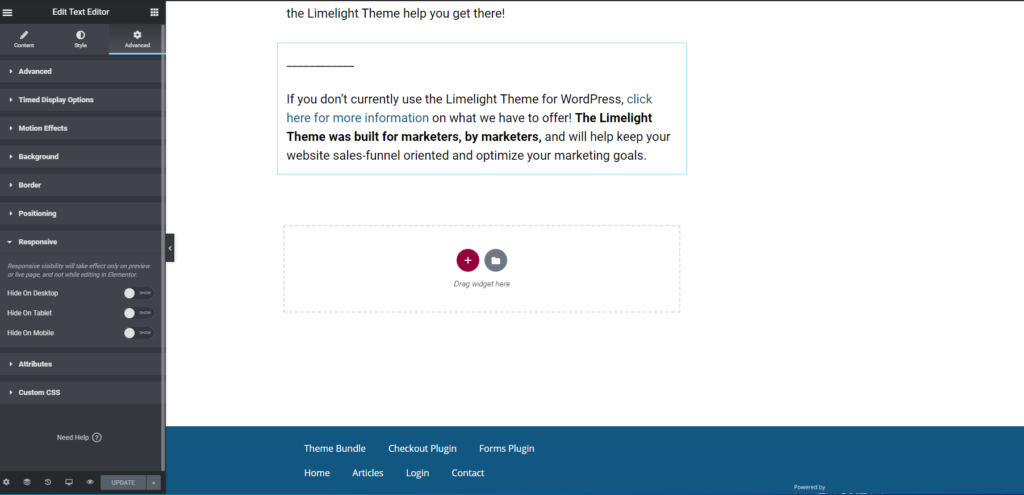
Specifically, you’ll have the option to set mobile responsive content for phones, tablets, and desktops. All of the responsive features are on the right hand side of the elementor settings bar under the “Advanced” tab and then under “Responsive.” That is specifically where you can hide whole blocks of content!
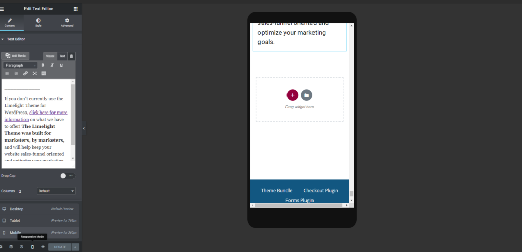
In addition to those settings, you can also view what your website will look like on different platforms and make corresponding changes with the “Responsive Mode” icon at the very bottom left corner of the page. This will change the actual appearance of your screen so you can see what your content will look like.
Have a handy list of icons on the desktop version of your website but it doesn’t come out right on mobile? Just hide the entire block of content on mobile while keeping it visible on desktop. It’s that easy.
If you’re wondering how to fix common mobile design problems, here are some best practice tips to use with the Limelight/Elementor bundle:
- Don’t use small fonts on mobile devices. We don’t want any users to have to pinch and zoom.
- Make sure your content is all one column. Any more than that will be too small for mobile devices.
- If a specific part of your design just doesn’t translate well onto mobile, consider hiding that section altogether. If it’s really important information that you can’t hide, it’s probably best to change the layout.
- Check your headlines and the padding/margins around them. Sometimes the formatting is funky initially on mobile devices.
- Always test and check the results on a mobile device yourself! Systems glitch. It happens!
The Results
More and more people are using mobile devices to make online purchases. Even if they don’t purchase immediately, site visitors are still window shopping, comparing options, and looking for accessible information. If your website doesn’t look appealing and have great functionality on their phone or tablet, odds are they won’t stay long enough to find out about your killer products or services.
Mobile optimization is the best way to address all aspects of your website and make sure that it is visually appealing and easy to use on all devices — and your sales will end up reflecting it.
The Limelight Theme has the tools you’ll need to ensure your website is mobile optimized, giving you full editing control of each device layout and design — and the benefits don’t just stop with the Elementor Pro plugin that’s included.
The theme bundle also includes our Forms, Checkout, and various other plugins to keep your website conversion and sales-oriented, allowing you to truly focus on engaging your visitors and increasing your online profits. If you want to capitalize on your untapped online sales potential, the Limelight Theme bundle will help you create a website with your profits in mind.
You could be making even more in sales with an appealing, easy-to-read website that grabs site visitors’ attention.
Optimize your website for mobile devices now and give your profits a boost!
________________
If you don’t currently use the Limelight Theme for WordPress, click here for more information on what we have to offer! The Limelight Theme was built for marketers, by marketers, and will help keep your website sales-funnel oriented and optimize your marketing goals.

